
I guess I am on the turf, uniform number, cap, and pizza beat this offseason.
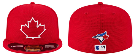
On Wednesday afternoon New Era, the official cap supplier for Major League Baseball, unveiled a brand new alternate batting practice cap for the Toronto Blue Jays. The cap, from their "Diamond Era" line, is all red from the panels to the brim to the button, except for a white outline of a stylized maple leaf in front and the Blue Jays and MLB logos in the back. It is unclear whether the red inside the leaf outline is actually a patch of red fabric, or just the red base. Seven other teams (the Braves, White Sox, Pirates, Padres, Rangers, Cubs, and Mets) will be receiving new caps, as detailed on Sportslogos.net.
The red alternate is meant to add to the collection of field caps, to be used in conjunction with the blue alternate and the regular cap.
The Blue Jays’ new alternate cap is very similar to the current alternate—which was used for batting practice, spring training, and select games during the 2013 regular season—except it has a red base instead of blue. Major League Baseball was the one who proposed the maple leaf cap design to the Blue Jays in 2013, but the Blue Jays demanded that their branding be included somewhere in the cap, so they compromised by adding their logo to the back, just above the MLB silhouette.
Images from New Era
I am not a fan of the maple leaf design primarily because the team that will wear it is called the Toronto Blue Jays not the Canada Red Maple Leaves—at least the blue alternate has the team’s main colour as the base. Yes, the Blue Jays are Canada’s sole remaining major league club, but they are not Team Canada; the cap is just not appropriate for the team. There is literally no Toronto or Blue or Jays in the front of the cap. I love Canada and am as patriotic as the next guy, but please stop shoving the maple leaf in my face. If the idea is to do something that does not have the Blue Jays’ current logo in the front, why not use a stylized of the Toronto city flag? More importantly, why not red pandas?
2013: New Blue Jays Caps Leaked To Bluebird Banter!
 I am disappointed that New Era did not take any of my ideas from this post for products. I would so buy #3, #5, and #6. Instead, as promotions this season, Jays fans will get a Blue Jays cowboy hat and a red bucket hat. Sigh.
 My hope is that the red caps will only be worn on Canada Day, with a red jersey, and the annual spring training exhibition game against the Canadian national team. The all-red cap would look horrible with the Blue Jays jerseys.
Of course, my views don’t represent the general fan base and just by walking around Toronto I can see how popular the blue alternates are. I know this new cap will be very popular and sell well, so the maple leaf motif will be here to stay until the next redesign. (The good news is that batting practice caps have been changed every three years or so.) Also, I would like to state that the Blue Jays had a 2-1 won-loss record when wearing their maple leaf alternates in 2013, another reason to keep them (and burn the grey away uniforms!).
If the maple leaf design was a must, one thing the designers could’ve done to make the new cap a little better was to have a blue brim instead as a nod to the Blue Jays’ first specialized batting practice cap which was introduced in the late 1990s. Not only will it be a subtle (ok, very subtle) reference to its progenitor, it would also incorporate blue back into the design, which is what the whole recent Blue Jays re-branding was about, no?
One good thing that may come from this cap is the possible demise of the even horrible-er "Stars and Stripes" caps that are worn for Memorial Day and Independence Day. Also, just like last year's announcement, we can say, "at least they're not like the Braves."